[ SubscribeStar Mirror ]
[ Release 0.3.0-A ]
Hello one and all~ It’s been a while since we last touched base, so let’s explore all the recent changes and additions.
Character Creator
We have some new Iris styles, eyelash styles, eyebrow styles, and clothing sets. Eyebrow styles can now be rotated, scaled and re-positioned. I’ve added toes to our player and replaced the kitsune tail with a design featuring a little more floof. As for new clothing sets, we have:
- Dapper: The base male clothing set has been completely replaced with a simple but dapper fit.
- Sky-Punk: A steampunkey engineer outfit set with a male and female variant. I suspect this set will need some re-texturing, but for now at least, we have more options to work with.

The next outfit to be developed is a meido outfit. I’m not sure whether it will make next update or the update after, but it is under development.
For the next body upgrade I’ll further improve upon the general topology, add nails, add female genitalia, and add more body morphs. I’d love to have more face variation, some muscle morphs, and more masculine morphs to even out our options. Pregnancy / inflation morphs are also necessary in preparation for what’s to come.
New Hair Gradients
For [0.3.0-A] I’ve added the option to apply a color gradient to any hair style and sliders to offset and soften said gradient. These new options allow you to create some pretty funky styles.

In addition to this, there is now a hair melanin slider. This was added to correct the issue of color options on UI not matching up with the character hair color. It does what it says on the tin and allows you to decide how much melanin you want added to your hair color. It’s a nice feature, but I don’t think it will stick as an option for the same reason we don’t have a hue slider or color wheel for hair. The option has the potential to break continuity between visual and described color.
Speaking of colors, in an upcoming patch I would like to rework the way color swatches are displayed on UI. The current approach takes up far too much space. I may switch back to a pop-out approach, reduce the scale of the swatch buttons, and/or display only the base tones alongside a luminosity slider.

New Skin Options
Finally, I’ve moved the skin color options (i.e. skin, lip, nip/tip) out of the slider section and into a newly dedicated skin section. This section will be used for applying makeup, scars, tattoos, and other skin related things to your characters appearance. To kick things off, I’ve added, 3 Scar Options, several beauty mark options including a couple freckle variants, and a basic eyeshadow option with the ability to specify opacity and color.

Sandbox Development Updates
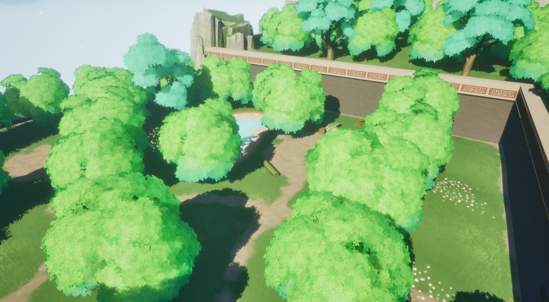
Now onto sandbox development. It’s been a couple months since the last DevLog, so there’s plenty to discuss. First up, the aesthetic. I’ve been working to reduce the amount of visual noise in map design and blend all our elements together. There have been micro adjustments across the board.


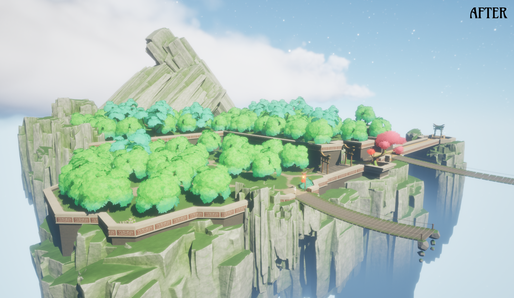

I feel as though we’re getting close to a decent all around aesthetic. There are still things I wish to test and change so I will continue to iterate.
Player Interfaces – Some of the old, Some of the new~
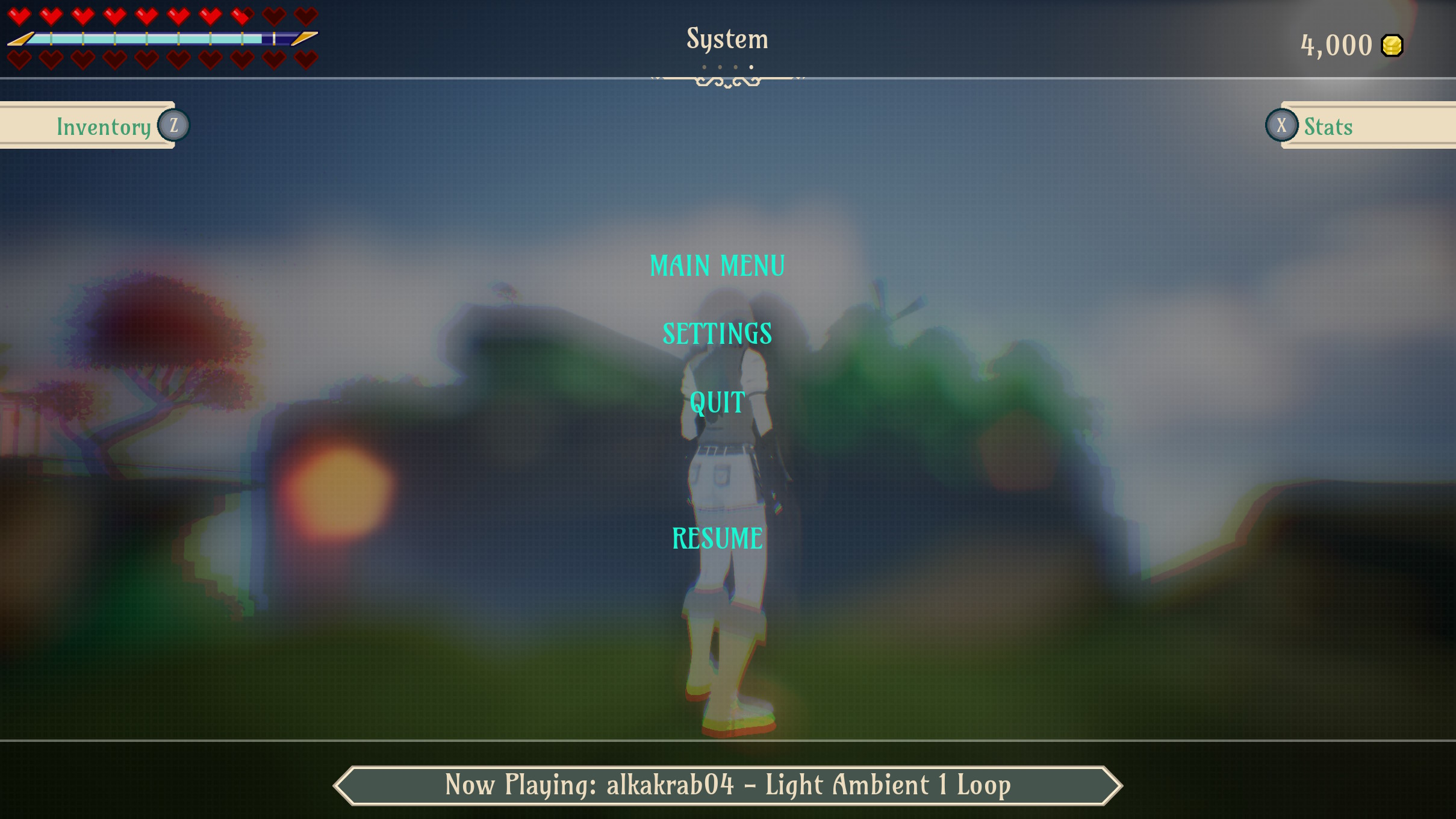
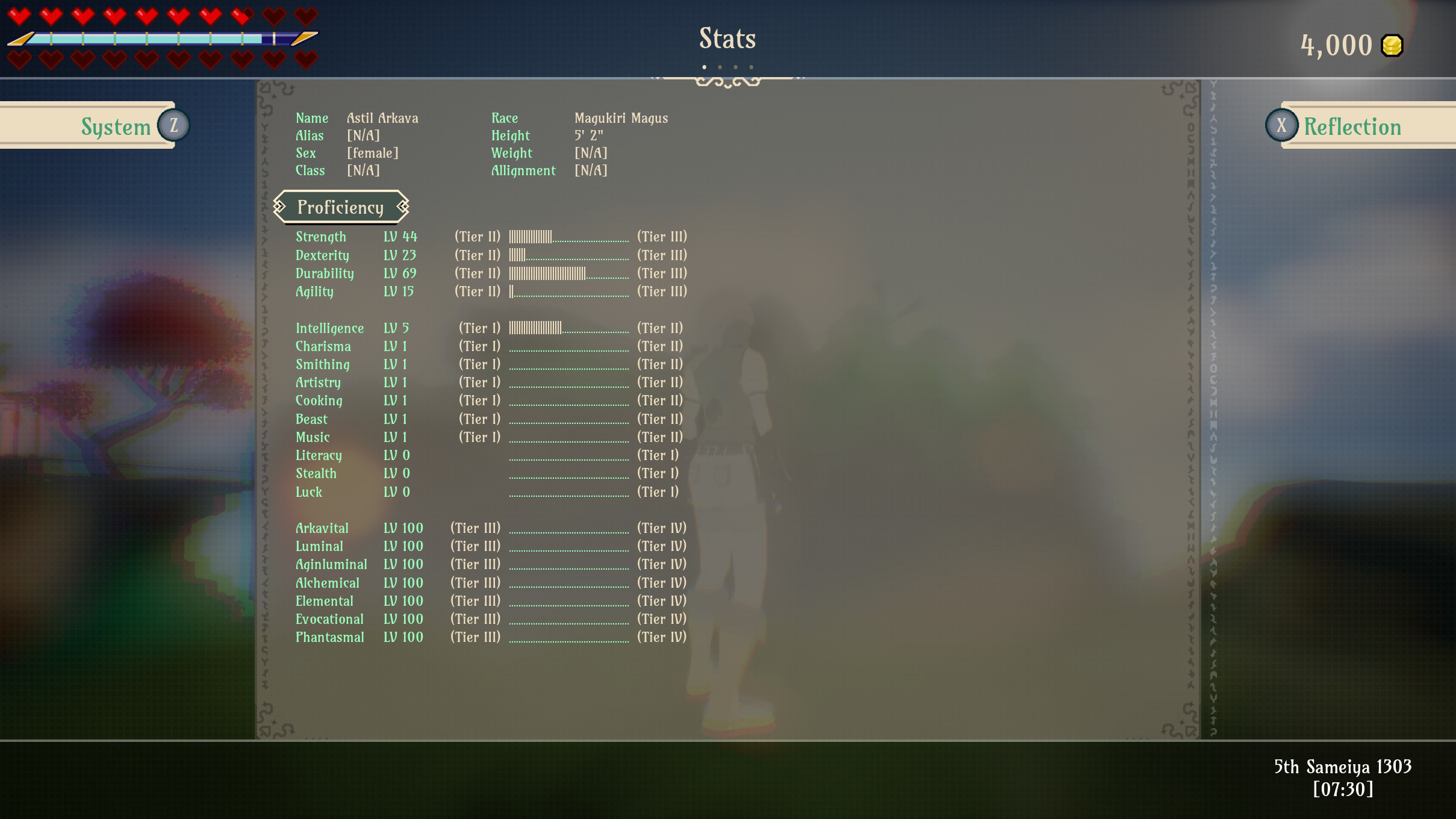
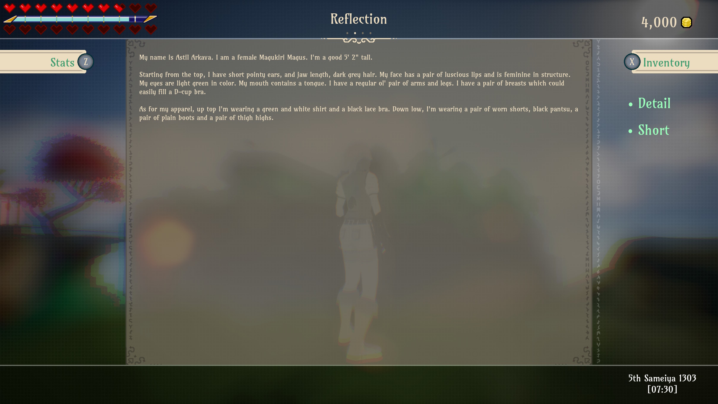
As you can see below, I’ve added a HUD, a system menu, an inventory screen, a reflection screen, and a stats screen.
The Reflection screen allows you to view a summary description of your character appearance in short form and in detail. The detailed description is similar to what’s displayed at character creation.
The stats screen currently outputs all key player stats. More details are expected to be added, such as character traits (blessings and curses), and I imagine in future, this screen will link to a progression menu which visualizes branching skills the player can acquire.
The functions of the inventory should be fairly self explanatory. The inventory allows you to use items and toggle equips. The command scripting framework which facilitates this is now online. As I mentioned previously, this system allows for the creation of items and management of events throughout the game. And with all that in mind, this means our two scripted items (The Moella and Taiyaki) are back. These two items along with our other food and drink items can now be consumed for stat regen.
I’ve also added the Time Manager. This is a system which keeps track of the in-game world time and calendar system. It is also used to drive the day/night cycle and event system.
A lot of this work really was retreading old ground but I’m glad it’s out the way as it now means we’re well into new territory.
Slime Time Slime Time

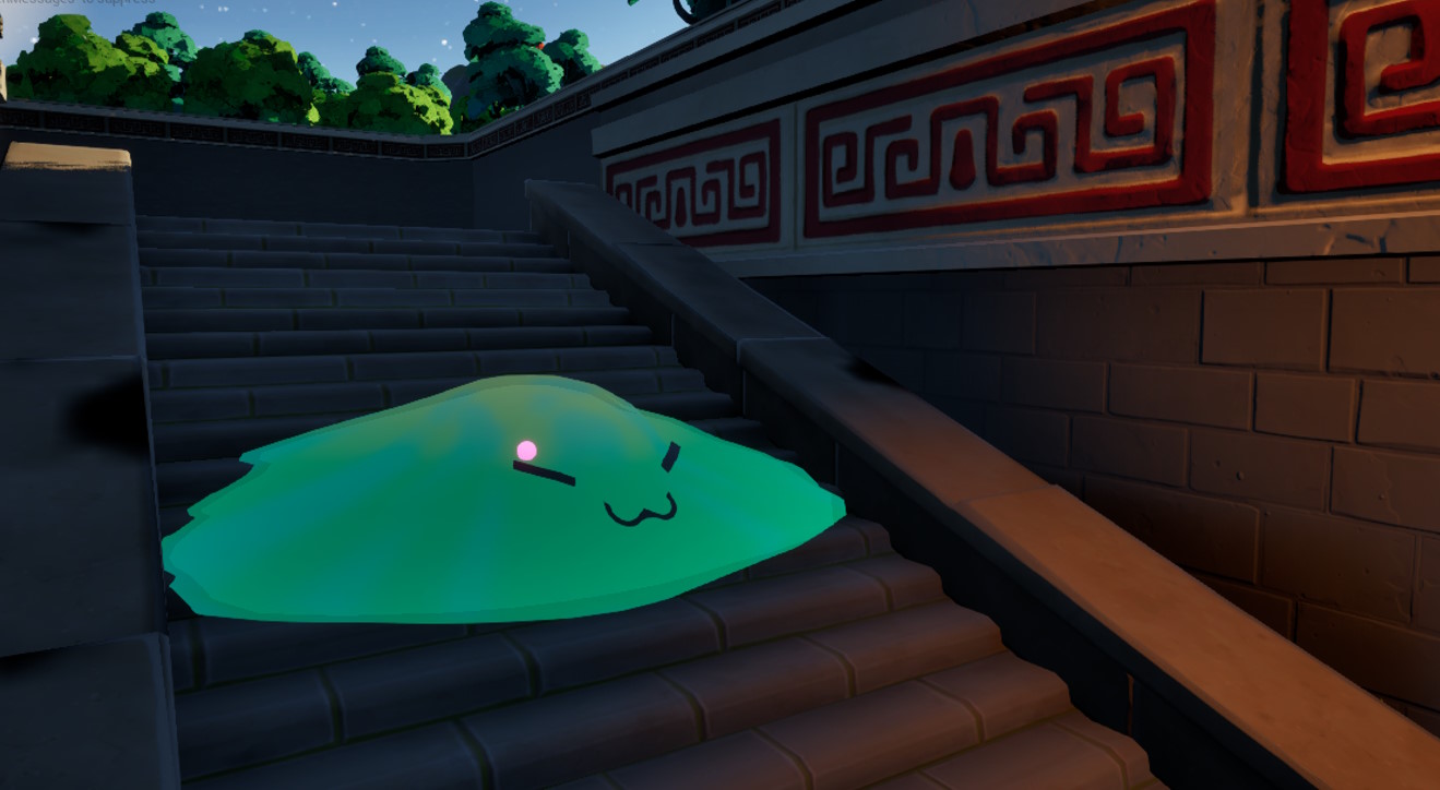
For our first enemy, I’ve modeled up some very friend shaped slimes. I will be focusing some more on the player attack system before giving slimes real autonomy as I don’t want to deal with loss scenarios just yet. For the time being they are consigned to valiantly sliding around the map and looking cute.
More To Come
As of writing this, I am focusing on player combat, combat animations, idles and movement SFX. Over the coming weeks I’ll be testing attacks and getting a real feel for how combat should flow and evolve. In that same vein I may also begin messing with the player camera and perspective… As for character creation, In addition to the aforementioned body/UI changes, much of what I’ve recently been working on has been closely tied to player animation and environmental design. With that in mind, I’ll be bumping up the priority on adding those character preview environments and poses.
I best be scurrying back to the development caves, so that’s all for now. Be sure to let me know what you think of all these new additions. If there are any areas you want to see be explored in more detail I’d love to hear your thoughts down below. If you like what I do and want to help support Arkavite, please consider becoming a subscriber or giving the project a follow on SubscribeStar~
Thanks for sticking around! Till next time~


