[ SubscribeStar Mirror ]
[ Experimental Release 0.0.0-3 ]
Ello ello~ There is much to report!
The next experimental build will be posted shortly, but for now, let’s get right into the news.
These last few weeks my primary focus has been finalization of the player skeleton so that sandbox development may resume. This finalization process did result in a little model revision… which snowballed into a lot of model revisions following our discussions in the ol’ Discord server.
We’ll begin with the most glaring change. The head and face have been completely remodeled.
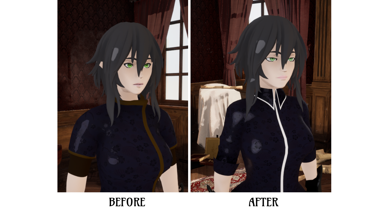
Larger eyes, improved facial structure, and supple lips with improved topology for animating.
The consensus so far is that this is a notable improvement over the previous iteration. Admittedly, after staring at the previous face for so long, the new one has taken some getting used to. That said, the new look has grown on me. It edges away from realism and leans into the realm of style. I like where it’s headed. Be sure to let me know what you think~
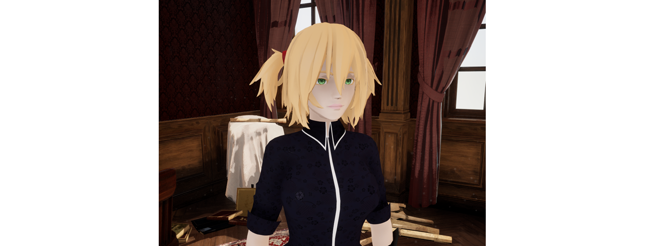
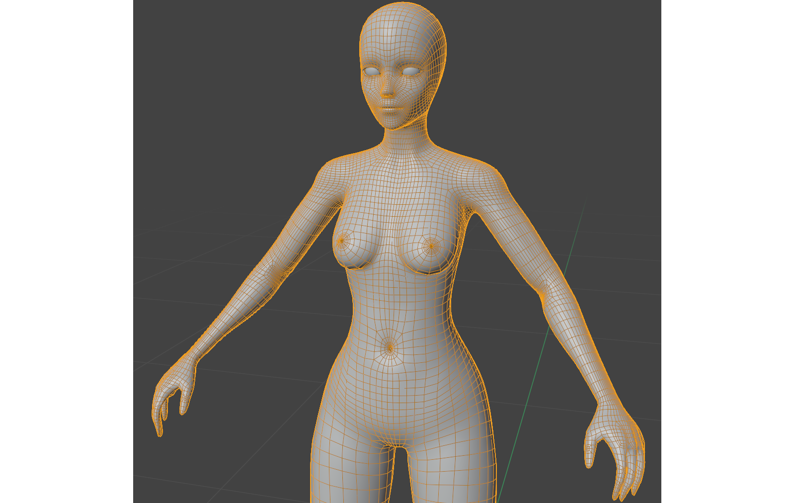
Moving swiftly on, since I cleaned up the face, I couldn’t stop there. As if led by my own mania, I became absorbed in cleaning up the rest of the body and ironing out the mesh geometry. The goal was to further improve upon the model topology so that animations moving forward are cleaner. I believe I have achieved this. All the outfit components were adjusted to fit, and in testing the movement is better than before.
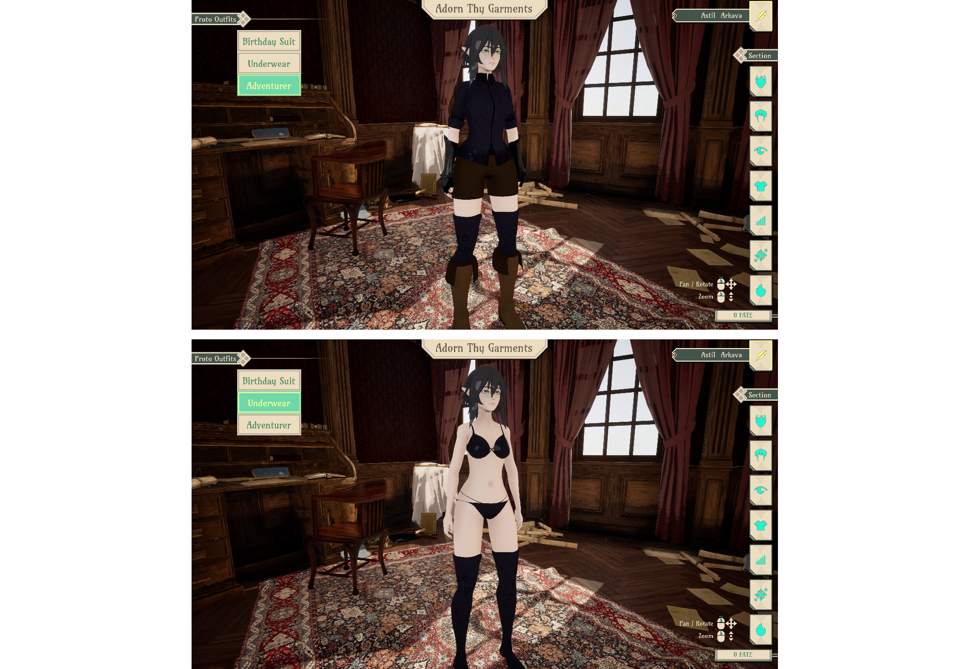
Drowning In Drip
Speaking of outfits, I remodeled the player shorts, shirt, socks and boots. I wanted to go for a more fantasy aesthetic with the boots. I also modeled up a set of underwear for the player.
After the male base outfit is sorted I’ll begin creating a Meido starter outfit to pair with the cuteness curse. Maids are cute, right?
Hair
All hair models required revision to fit the new head shape. During this process I implemented the basics of our modular hair framework, and made substantial advancements with hair physics. Most styles and attachments are now physics enabled. A few remain which require physics to be applied or re-applied due to instability. Just a few kinks in the process which will be buffed out.
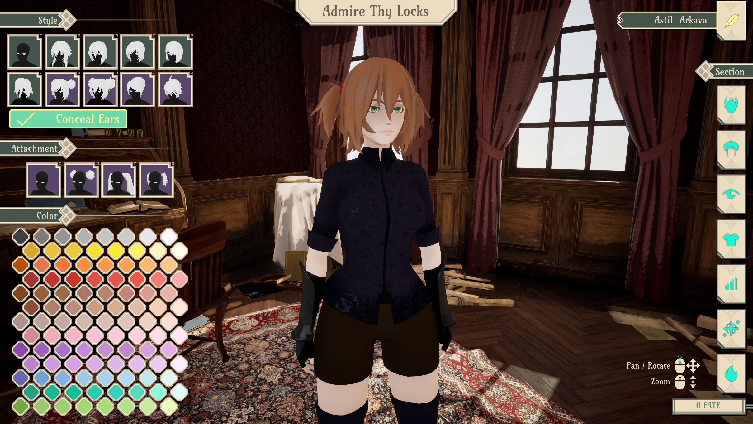
So, how does this modular hair system work? As outlined in the roadmap, we have begun with modular buns and ponytails. Of our base hairstyles, four of them have been set up with modular attachments. These styles have been marked with a purple background. Of the four, the first two allow for twin attachment points, so you can have twin buns or twintails. The second two have a rear attachment point, allowing for the attachment of various ponytails and buns.

I quite like this system as the addition of new attachments or bases exponentially increase the number of potential styles to choose from.
To close on the topic of hair, one last thing I’d like to discuss is the inclusion of a “Conceal Ears” toggle. This has been added exclusively for the Magus race and serves two purposes. Firstly, their ears are short enough such that one could argue Magus can hide their ears behind their hair. In some cases this is a desired “look”, so the option is there.
Secondly, since our kemonomimi races are anatomically correct, there is hair in places where ears would normally be expected to stick out. This means that in the case of Magus, their ears will almost always end up clipping through the hairstyles. This is predominantly an issue for styles which are short on the sides. In future, I intend to resolve this by designing base variants which take into consideration non-kemonomimi ear placement.
Sandbox Development
Sandbox development has sort of kicked back off again. I’ve added player movement (walk, run and jump). Last post I mentioned I’d like to get leg IK working. This process ensures our legs position themselves correctly depending on the terrain beneath them, so when a player walks on stairs, their feet connect with the individual steps rather than clipping through them. Or, if the player happens to be standing on uneven terrain, their feet would remain planted on the ground beneath them (as opposed to having one foot hover or another foot clip). It’s one of those overlooked details which has a big impact, and I just love the look of it when it works.
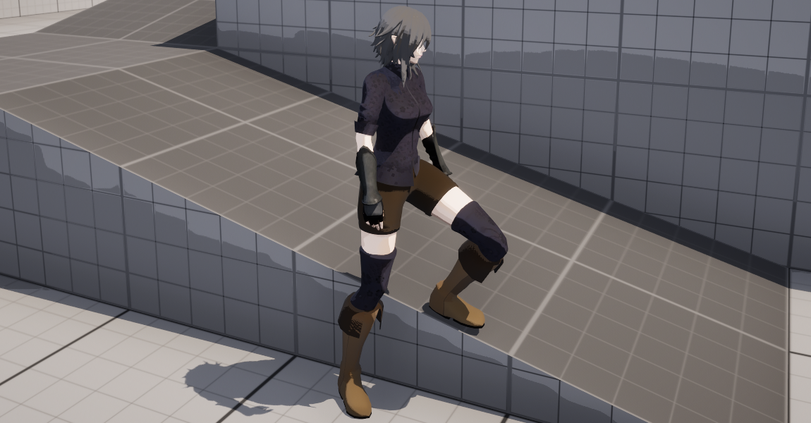
I’ve included some earlier test footage of the legs in motion below. Note, this was recorded before the face and body update, so it looks a little different to the image above.
Later I’d like to add turn based tilt for run animations. I ran some quick tests earlier. Didn’t work so well. There are several more aspects to movement and control which I should really square away first, so we’ll return to that little detail another time.
Finally, I’ve added a pose system to the player which handles pose animations in the character creator. It’s now only a matter of loading the system up with pose animations and adding the ability to switch poses on UI. I figure it will also find use in a future photo mode.
This, That & The Other Thing
Some other changes and additions made these last few weeks.
- Audio Updates
- Refactored the game audio management system and fixed some underlying pointer issues
- Added additional BGM to the Extras audio compendium
- Added additional BGM to the character creator. The Unity playlist is finally making a comeback
- Added choice portrait for [Broken]
- Shrunk and symmetrized limiter seal texture for the player mesh
- Eye Updates
- Added Heterochromia toggle for eye color (This may later be tied into another Boon/Bane trait choice)
- Added new eye style option. I should add cat eyes and heart eyes at some point shouldn’t I?
- Credits page update
One final plug. If you’re not already on the Discord server I would recommend checking it out and joining in on the chit chat. I post updates in the #arkavite channel frequently as developments are developed, so if you ever want see all this unfold in real time or shout at me directly, that’s the place to be!
This weekend I will be putting together a basic sandbox map, modelling up some dicks and porting over the character description parser. I would also like to add the basic “player archetype” selection screen to the character creator, but that will depend on available time. In the new week I’ll be jumping between working on the male base, implementing choice functions, and beginning a port of our old inventory system.
And that is all for now. Thank you all for following along. Be sure to let me know your thoughts, and I hope you all have a wonderful day.
Till the next one~
ngl I kinda don’t think the new face looks better. Part of it is lack of visual contrast I think (the old model had more prominent eyeliner and more defined mouth due to more visible shading) but shape of the eye and chin was also cuter. The new one is definitely more readily expressive but resting eye position looks sarcastic or tired, whereas in the old one it looked innocent (or coquettish). It does look like it’d be more flexible and therefore easier to get more expressions, but I think there’s still room for improvement and some of that improvement could involve taking inspiration from the old version.
The walking animations are very cool. There’s still some things to do — in the video, the heels fall just short of reaching the ground at a natural angle, though the body rework might have already fixed this, and it looks like you need a little something to ease the animation on landing from a jump. But it’s a great start, I don’t remember seeing basic animations this dynamic since Overgrowth.
Overall things are looking good; don’t lose hope in the long journey to having actual gameplay.
Hi! Thank you for the feedback!
I haven’t added eyeliner just yet. I assume you mean the lashes, and I agree those could totally be improved. I think it would also be great if I’m able to later include multiple lash options. Long term, I do want to provide players with some more options for face customisation (face sliders, makeup, etc.) so everyone isn’t stuck with the same face. There are just other things which need to be done first.
I will note, the face “resting position” is just the reference pose the face is modelled in. It’s a ground state for me to animate expressions from and shouldn’t be the actual “neutral resting expression” you see in game once face animations are added. Think of it like a T-Pose for the face.
There’s certainly still room for improvement all around. In my opinion, what the whole body is really lacking is texture to give it depth. At the moment it has a completely flat texture with no detail or shading. The current shading you see is a result of the lighting, mesh geometry and cel shader. Having the game be cel shaded certainly helps, but I think once I properly texture the body it should elevate the work. Hair could also stand to be improved. I’m not pleased with the way it currently interacts with light and it may benefit from some subtle texturing. I could add some basic gradients or just a touch of natural shadow/highlights to make it pop.
The current body animations are very much placeholder. I imagine the final animations will look very different (Ideally better and more refined than what we have now). And yes, I think after the retopologizing and rigging it does move better. There are still things you mention like “landing” which need ironing out, but that’s more on the end of creating better animations which should come with time.
Thank you again! I’ll try my best not to fall apart.
By eyeliner I mean what looks like eyeliner in the “old” face. That very well may be meant to be lashes, but in terms of visual prominence and positioning eyeliner is more what it looks like.
I see what you mean about the “T-pose” of face, I guess I misunderstood the intent there since the comparison shot is in-engine and looks like it’s meant to be parallel.
Baked in shading will definitely help, the lighting shader already does a lot. I think the hair is okay but you’re right, the bit of texturing as you describe would help. If it’s not difficult to implement, it might be good to put this on an intensity slider though. People who spend a lot of time outdoors have more defined difference in color (as natural highlights are mostly due to sun-bleaching) whereas the comparatively flat hair color in the examples on this post are accurate to more indoorsy folks. I felt like the kind of mousey hair that this default character has suits a character who you would see in their study, like the background you put her in front of. This also applies to texture/shape of the hair a bit but that is much harder to make dynamic in the same way.
I also think in terms of the shape of the chin you went for a middle ground between realistic western style and exaggerated femme/anime style and it ends up just looking like a more androgynous anime style – even though it’s not really an unrealistic face shape for real women, it looks kind of masculine in the context of the other stylistic elements.
I know the specific animations are still WIP, but the system you’re using to connect them is what I mean looks really good. I mean, it’s good enough that I can point out a couple specific things to fix/finish so that’s already a high bar. I know there’s also animations for every other thing besides basic locomotion but the basic locomotion is pretty damn solid.